
Like a hungry junior data viz designer, this PieChartGPT skates to one song and one song only: Pie charts.
How to use
- Enter the data or topic you’d like visualized (wait for the full reply to load)
- Refresh this page (sry there is a bunch of JS that needs to run)
- Smile, you have pie now. (right-click to save & eat later)
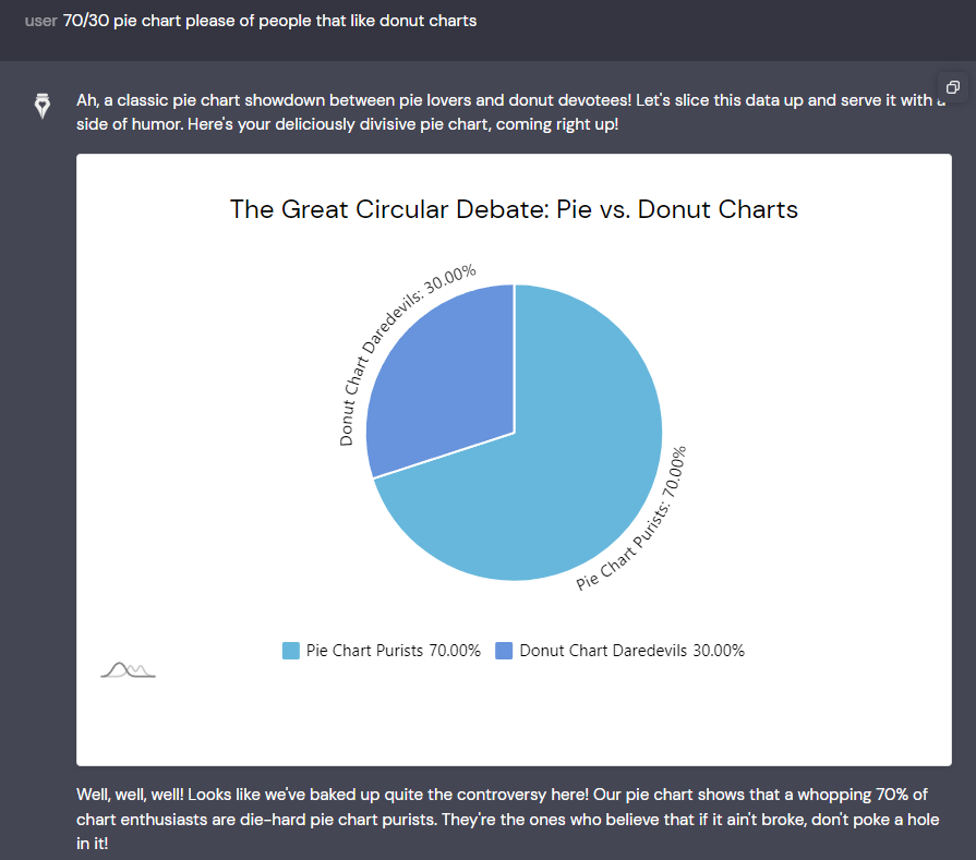
Try: “give me a 70/30 people that like doughnuts vs pie”
What is this?
This proof-of-concept combines Anthropic and amCharts in a way that lets the AI use a JS library to visualize data.
Platforms like Anthropic and OpenAI are constrained by their scale and rights-of-use for rendering charts, while custom-built solutions like CauseWriter.ai can just build with these libraries for our users.
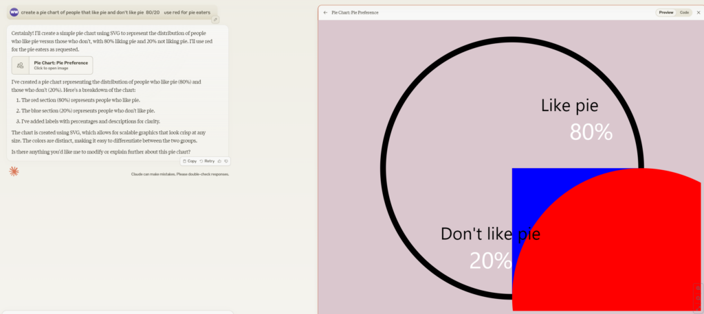
Anthropic made pie
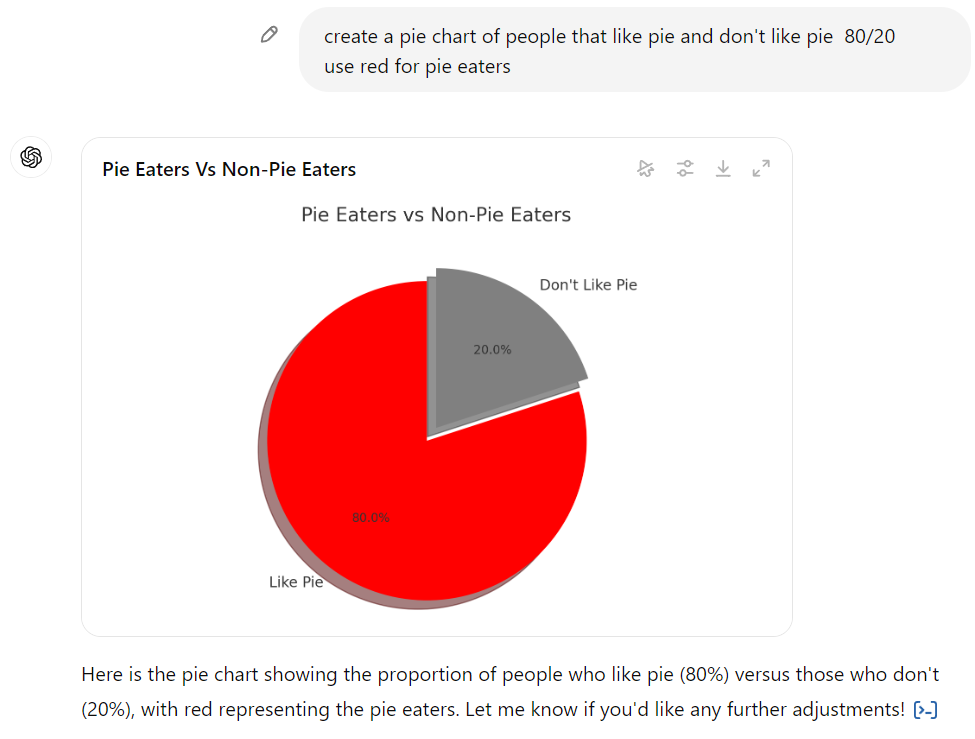
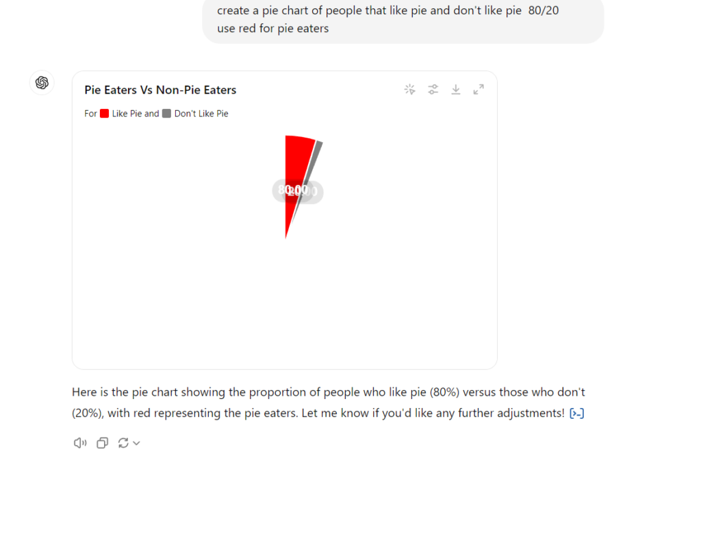
OpenAI made pie
Pie from CauseWriter + AmCharts
Why Pie is for eating not charting
Avinash Kaushik, a prominent digital marketing and analytics expert, is famously critical of pie charts for several reasons:
- Hard to Compare Sections: Humans struggle to compare the sizes of pie chart slices, especially when they are close in size. This makes it difficult to accurately interpret the data.
- Limited Data Representation: Pie charts can only display one data series and a limited number of categories, making them unsuitable for complex data sets.
- No Context for Absolute Values: Pie charts often lack clarity about the actual data values behind the proportions. Bar charts, in contrast, provide both relative size and actual values, which are easier to interpret.
- Inefficient Use of Space: Pie charts take up more space than other visualizations like bar charts, while conveying less information. A bar chart can show the same data more effectively in less space.